No, I can't look at a set of data without wondering if I can play around with it and make it show me something useful.
I am working on weight loss. Weight loss, of course, can appear to vary from day to day due to normal fluctuations and factors such as how much sleep you got on a particular night. It can be difficult and frustrating to look at the scale two or three days in a row and see no progress. I haven't really struggled with motivation this time around but I really needed to lose the weight which has gradually crept up (25 pounds in the past fifteen years or so) and needs to be back down.
The plan was irrelevant. That is a personal decision and what matters is what works for you and what you can sustain in the long term so that you don't just shoot right back up again. I have been on a low carb diet for over fifteen years. For me that means minimizing carbs, not eliminating them. The gradual weight gain stems from occasional lapses over longer terms (too many sweets at Christmas, donuts, etc) while not making a concerted effort to keep off the pounds that came from the lapses. Two months ago I decided to remedy that.
However, data is spiky. It can go up and down. Just look at the stock market or temperature data for examples. In business a rolling average is used to smooth out the spikes and look at trends. I decided to see if I could use Excel to create rolling averages.
I have Excel 2007. It doesn't have a Moving Average feature which apparently is included in the newer versions. It does have "=average(A1:A7)". That is the average of the first seven data points.
Drag down on the corner of that box and it copies the formula to the next box, but adjusts to "=average(A2:A8)", and continues adjusting until you stop dragging. Pretty cool really.
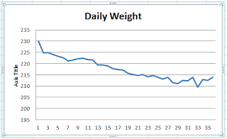
The next question, of course, is how to get those rolling averages into a format that you can use. A basic line graph is generally useful and easy to read so I Inserted a Line Chart, chose the data by selecting all the rolling averages, and told Excel to make a graph. This is what I got.
That's a pretty cool graph. I can clearly see that the last seven day average has actually ticked up a bit. If we compare that to the raw data it seems much easier to visualize how things are going. Plus it is a much prettier graph.
That being said, is there something more productive that I could have been doing? Probably. But I'm having fun. So there's that.


No comments:
Post a Comment